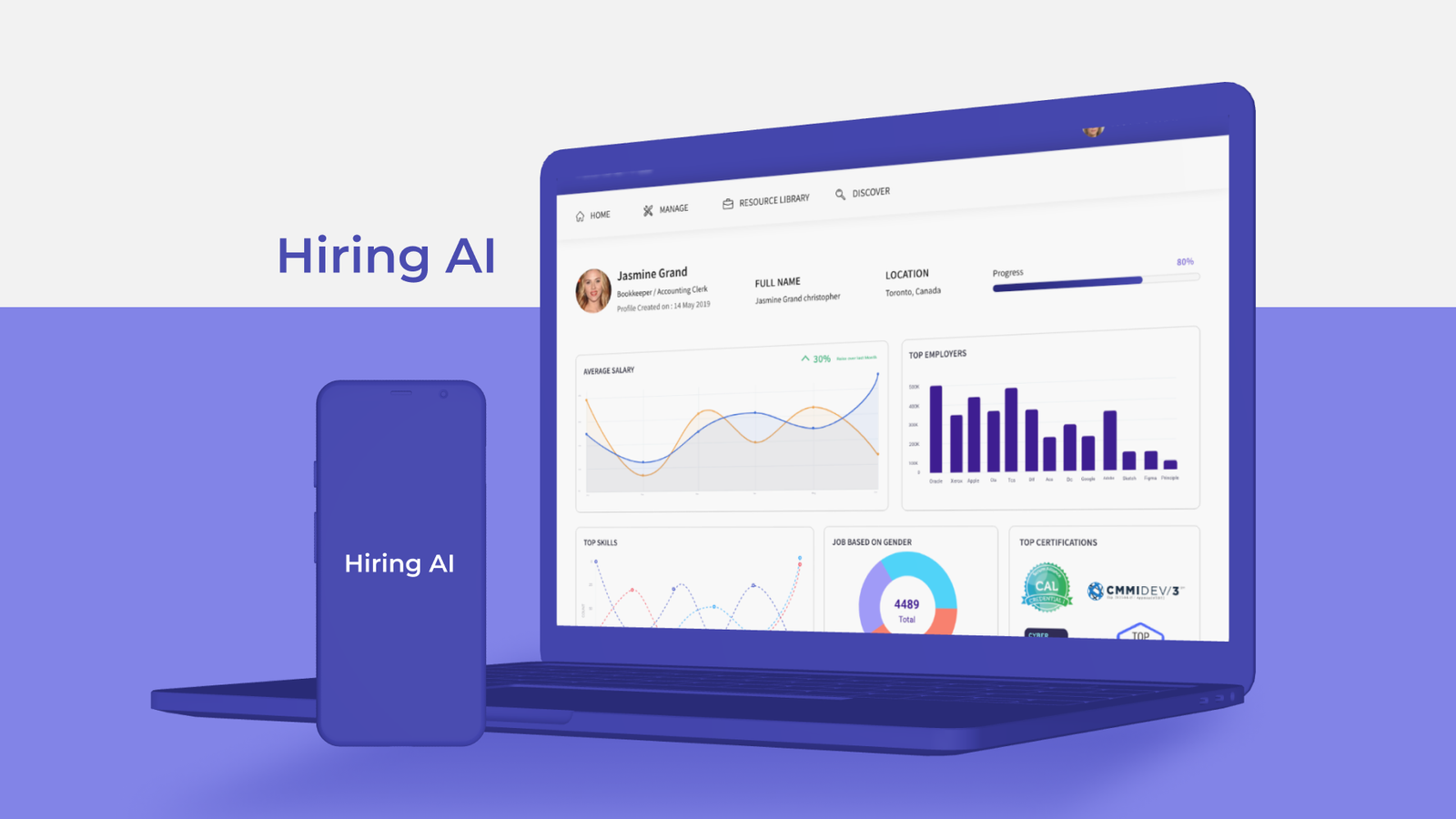
About the Project 01 Summary 02 Hiring Ai is a product focusing on providing a ‘GPS’ for Work & Education Pathways using a workforce development strategy. This strategy aims to increase education, training, and learning opportunities for America’s current and emerging workforce, with the help of AI-powered tools provided by Hiring AI. The platform offers programs and services to develop students’ core academic, technical, and employability skills, and to provide continuous education, training, and placement in high-demand, high-opportunity jobs. The changing landscape of work and learning, defined by digital technologies and automation, requires new models and tools, which Hiring AI aims to provide. Challenge 03 Hiring Ai has numerous features for mobile and web applications, including an end-user mobile app for selecting career pathways and an enterprise version for companies to aid employee growth. Upskilling the workforce using AI algorithms was a top priority, but designing an enterprise application with AI presents challenges. AI is still in its early stages, and unrealistic expectations can be a problem. The challenge was to make the experience and AI of this data-heavy system work together. Data was collected from various sources, including skills, jobs, job demand in various locations, and employer profiles, and developing an experience that could complement the design was a challenge. Solution 04 A well-designed app solves the real problems of real users with the help of user research. It understands user behavior, user requirements and preferences, and pain points that existing software has not been able to address. EMPATHISE / UNDERSTAND “User-centered design means to understand what your users need, how they think and how they behave- and incorporating that into every aspect of the design process.” We aimed to create a solution that would benefit users, employees, and organizations by simplifying complex career pathways. To achieve this, we conducted 1:1 interviews and built empathy maps, while aligning ourselves with business goals through stakeholder and subject matter expert interactions. After defining requirements, we created a product strategy to build a robust platform that enables career transitions and can be white labelled for internal use by different companies. DEFINE “The only sustainable competitive advantage is the organization’s ability to learn faster than its competition.” After analyzing our product requirements and researching competitors in the upskilling market space, we created a clear project roadmap with prioritized features. We decided to build a mobile app for users and employees, and a dashboard for enterprise customers. While we found no direct competitors, there were several indirect ones such as guider, Udemy, degreed, Coorpacademy, etc. However, none of them offered options for career transitions. To address this gap, we used advanced AI techniques to understand the user’s current career stage and provide various pathways for a smooth transition. Our data science team collected data from various sources and built algorithms to support this functionality. IDEATE “Designs never begins with some preconceived idea, rather the idea is a result of careful study and observation.” We began the design process with whiteboarding sessions and storyboarding, involving multiple teams to collaborate on building the product. We then organized the user journey flow for both the enterprise and end-user applications and created the information architecture, prioritizing content and creating a feature hierarchy with input from business, engineering, and product members. With the information architecture and list of screens in place, we proceeded to sketch out our ideas. DESIGN / PROTOTYPE “Good design is good business…” We used pen and paper to sketch out our ideas, which was cost-effective and allowed everyone on the team to contribute. We then used Adobe XD to convert the low-fidelity wireframes to high-fidelity designs and create a clickable prototype. This prototype helped us identify potential challenges and ensure the design aligned with both user and business goals. We shared the prototype with stakeholders for feedback. IMPLEMENT “Styles come and go but good design is a language, not a style.” After finalizing the high fidelity wireframe, we followed material design standards to build out the visual design. We defined our colors and fonts in our design system, with minimal usage of colors to allow for customization by clients. The final mockup screens were built for both mobile and web, ensuring consistency across both platforms. The mobile application was for users and the desktop version was for organizations and enterprise customers. TEST AND LEARN “Designs are the silent ambassadors of the brand.” After the UI review, we enhanced the platform’s look and usability, incorporating feedback from stakeholders and subject matter experts. Final mockups were documented for development, with specifications on spacing, margins, and paddings. Assets were generated traditionally, with clarity for white-labeling. Using analytics tools, we studied heatmaps and user journeys to identify problems, and conducted internal and external user testing, identifying and addressing issues in subsequent releases. Conclusion 05 We understood that recognizing that creating the best enterprise application with the strongest UX we are capable of is an ongoing effort. Right from the start, We told ourselves (and our team) that you won’t get it right the first time. We encouraged collaboration and transparent communication in our team to ensure nobody felt too intimidated or shy about raising issues before a user does—this saved everyone time and reduced frustration. See more projects Hiring AI
Client:
Nepo Techologies
Project
Hiring AI
Year
2021


